7 Proven Instagram Bio Styles to Filter Audiences and Route Traffic
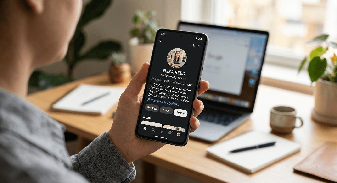
Most account operators treat the 150 characters under their profile picture as a memoir, crowding it with disconnected facts, inside jokes, and multiple conflicting calls to action. In reality, a profile bio is a high-stakes traffic router. Its only structural purpose is to filter out the wrong visitors while directing the right ones to a specific destination off the platform. When an account fails to convert profile views into clicks, the failure almost always stems from a mismatch between the visual signaling in the text and the expectations of the target audience.
Quick Summary
A profile bio operates as a 150-character filtering mechanism that balances cultural signaling with direct navigation. Choosing the correct format requires aligning your text hierarchy with your primary business objective, whether that is community verification, algorithmic survival, or immediate link conversion.
- Traffic efficiency requires isolation: Every tag or hashtag introduces a navigation leak.
- Symbols replace context: Emojis and unicode characters act as immediate subcultural filters.
- Metrics build trust: Professional formats rely on quantifiable data, not adjectives.
- Aesthetics cost accessibility: Custom fonts degrade screen reader functionality.
Table of Contents
- Evaluating the Trade-off: Routing vs. Signaling
- Bio Style Comparison Matrix
- 1. The Direct Router
- 2. The Subculture Anchor
- 3. The Values-Forward Filter
- 4. The Strategic Ambiguity Profile
- 5. The Equity Sharing Setup
- 6. The Aesthetic Gatekeeper
- 7. The Credentialed Authority
- Aligning Your Style With Your Goal
- FAQ
- Recommended Reads
Evaluating the Trade-off: Routing vs. Signaling
Every bio style must be judged against a single operational lens: the trade-off between information density and aesthetic signaling. A format designed purely to route traffic will strip out personality to ensure the click, while a format designed to signal belonging to a specific niche will sacrifice navigational clarity to prove authenticity. The items below are evaluated on how effectively they manage this balance for their specific audiences.
Bio Style Comparison Matrix
| Style | Best For | Primary Mechanism | Core Drawback |
|---|---|---|---|
| Direct Router | E-commerce, SaaS | Hard line breaks, single CTA | Lacks brand differentiation |
| Subculture Anchor | Gamers, Cosplayers | Niche quotes, inside references | Alienates mainstream sponsors |
| Values-Forward | Faith creators, Nonprofits | Ideological symbols at the top | Consumes valuable character count |
| Strategic Ambiguity | Restricted industries | Emojis and coded terminology | Shifts all sales weight to the link |
| Equity Sharing | Joint ventures, Couples | Tagging secondary accounts | Creates severe navigation leaks |
| Aesthetic Gatekeeper | Fashion, Beauty | Custom Unicode, lowercase text | Breaks screen reader accessibility |
| Credentialed Authority | Consultants, Agencies | Piped metrics, concrete claims | Reads as sterile without visual backup |
1. The Direct Router
A short bio for instagram serves a single purpose: moving a visitor from the profile page to an external landing page as rapidly as possible. This format targets e-commerce brands, high-volume content creators, and founders who treat social media purely as top-of-funnel acquisition. Rather than explaining the account's history, it strips out all secondary information in favor of a singular, aggressive call to action.
Mechanically, this layout relies on hard line breaks to isolate the most important text. The top line states the specific offer or outcome. The middle line provides a single point of validation, such as a client count or a shipping guarantee. The final line sits directly above the profile link, usually featuring a downward-pointing emoji that acts as a visual funnel. By removing hashtags and secondary account tags, the operator eliminates alternative click paths, forcing the user either to click the primary link or scroll down to the grid.
Frictionless navigation strips away personality
This approach treats text purely as a user interface. It works exceptionally well when the visual content in the grid already provides all the necessary context about who the creator is and what they stand for.
The honest limit here is brand differentiation. A purely functional layout does nothing to build a parasocial relationship or signal cultural belonging. Creators attempting to build community-driven brands, or those operating in highly saturated lifestyle niches where personality is the primary differentiator, should avoid this format entirely. It fails completely for accounts with low posting frequency, as the lack of context in the text leaves visitors with no reason to stay or click.
2. The Subculture Anchor
Deploying a naruto bio for instagram - or any specific anime, gaming, or subculture-focused layout - functions as a shibboleth. It is designed for niche creators, cosplay accounts, and dedicated fan pages who need to prove their authenticity to a highly protective community the moment a visitor lands on their page.
This format works by utilizing inside jokes, specific faction emojis, romanized Japanese terms, or obscure quotes that only a dedicated fan would recognize. Instead of explaining what the account does, the text assumes the reader already knows the context. The mechanism here is exclusion: it intentionally confuses out-group visitors while immediately building rapport with in-group members. The formatting is usually dense, often mixing different languages or specialized symbols to create a chaotic but culturally accurate aesthetic.
Deep community engagement remains invisible to outsiders
By speaking entirely in the coded language of the fandom, this style achieves incredibly high engagement rates among the target audience. Followers feel an immediate sense of shared identity, which translates to higher trust when clicking external links to Discord servers or merchandise stores.
However, this hyper-specificity is exactly where the style breaks down. Accounts utilizing this format actively alienate broader brand sponsors and mainstream audiences who do not understand the references. If a creator intends to pivot from niche content to a general lifestyle brand, or if they are pitching themselves to corporate sponsors for broader campaigns, this exclusionary text becomes a severe liability.
3. The Values-Forward Filter
Drafting a jesus bio for instagram requires placing core ideological identifiers at the absolute top of the text hierarchy. This style is built for faith-driven creators, religious nonprofits, and lifestyle bloggers who want to pre-qualify their audience based on shared moral or religious frameworks before any business transaction occurs.
Mechanically, this involves listing religious affiliations or scripture references in the very first line. Frequently, this involves using a cross for instagram bio setups to act as an immediate visual anchor, saving characters while delivering a clear message. The rest of the bio usually follows a softer, community-focused structure, often ending with a link to a podcast, a donation page, or a community group. The text is designed to attract followers seeking alignment rather than followers seeking a specific product.
Ideological alignment precedes the business offer
This format is highly effective at building an insulated, high-trust community. Visitors who share the stated values are significantly more likely to engage with the content and trust the creator's recommendations, as the relationship is framed around shared beliefs rather than commerce.
Space efficiency dictates the boundaries of this layout. The 150-character limit is unforgiving, and dedicating a quarter of it to ideological signaling means sacrificing room for a concrete value proposition or a clear call to action. Creators who sell complex services or high-ticket items often struggle with this format because they run out of characters before they can explain what they actually sell.
4. The Strategic Ambiguity Profile
When designing a stoner bio for instagram, creators in the cannabis space face strict algorithmic oversight. This format is essential for dispensaries, glassware artisans, and lifestyle advocates operating in restricted or heavily regulated industries where explicit text can trigger automated shadowbans or account deletion.
The mechanism here relies heavily on coded language and visual evasion. Instead of using restricted keywords, the text employs adjacent emojis (leaves, clouds, broccoli) and vague lifestyle terminology to signal the niche without tripping automated moderation filters. The bio avoids any direct mention of selling, pricing, or shipping restricted goods. Instead, it positions the account purely as an educational or aesthetic entity, pushing all commercial activity safely off the platform via the primary link.
Navigates algorithmic suppression through coded language
This format is a survival tactic. It keeps the account alive and visible in search results by maintaining plausible deniability regarding the nature of the business, allowing the visual grid to do the actual communication.
Stripping away descriptive details forces the external landing page to do all the heavy lifting. Because the bio text itself must remain frustratingly vague, the user arrives at the external link with very little preparation. If the external landing page is not perfectly optimized to immediately clarify the offer, the traffic will bounce. Businesses using this format cannot rely on their profile text to pre-sell the user; they can only use it to open the door.
5. The Equity Sharing Setup
An instagram bio for committed partnerships, family vloggers, or joint business ventures requires balancing two distinct identities. This format is designed for accounts where the primary value comes from the relationship between multiple people or entities, such as a creative agency and its founders, or a high-profile couple.
This layout works by utilizing the "@" symbol to cross-link to other profiles. The top line establishes the joint identity, followed by direct tags to the individual accounts involved. The mechanism is trust transfer: a visitor who trusts one partner immediately sees the verified connection to the other, distributing follower equity across a small network of related pages.
Distributes follower trust across multiple entities
Cross-tagging allows a central brand account to funnel traffic to the personal accounts of its founders, humanizing a corporate entity or establishing boundaries for a joint creator channel.
Practical rule: Every clickable element in a bio (such as an account tag or a hashtag) reduces the click-through rate of your primary landing page link by offering an alternative exit.
The drawback to this style is the navigation leak. Every time you tag another profile, you provide an exit ramp that competes directly with your external link. If your primary goal is to drive users to an external storefront or a booking page, filling your text with clickable tags to other profiles will severely dilute your outbound traffic. It is entirely unsuited for direct-response marketing.
6. The Aesthetic Gatekeeper
The typical baddie bio for instagram prioritizes visual cohesion over traditional readability. Targeted at fashion influencers, high-end beauty brands, and lifestyle models, this format relies heavily on high-status signaling to create an aura of exclusivity and effortless style.
Mechanically, this layout strips away traditional grammar. It relies on lowercase text, generous use of negative space, and custom Unicode fonts imported from third-party keyboards. Punctuation is minimal or entirely absent. The goal is not to inform the reader about what the account does, but to ensure the text block looks visually identical to the minimalist aesthetic of the photo grid below it. It treats words strictly as design elements.
Prioritizes visual cohesion over practical readability
This style successfully filters out users who require explicit instructions, appealing instead to an audience that responds to visual mood boards and implicit status cues. It creates a polished, editorial feel that aligns perfectly with luxury brand partnerships.
Accessibility and broad utility degrade rapidly with this specialized formatting. Custom Unicode characters often render as blank boxes on older operating systems, completely destroying the visual effect. Furthermore, screen readers cannot parse these custom fonts, freezing out visually impaired users. Finally, because the text relies on being effortlessly vague, it gives users no compelling reason to click the external link unless they are already deeply invested in the creator's visual brand.
7. The Credentialed Authority
Structuring a pro bio for instagram relies entirely on verifiable metrics. This format is engineered for B2B consultants, freelance specialists, agency owners, and educators who need to justify high ticket prices or consulting fees the moment a prospect lands on their page.
The mechanism is aggressive validation. Instead of using adjectives like "expert" or "passionate," this format uses hard numbers separated by pipes (|) or heavy bullet points. A standard layout might read: "$10M Ad Spend Managed | Featured in Forbes | Scaling SaaS to 7 Figures." It places the creator's most impressive historical achievement in the first line, followed by their current title, and finishes with a highly specific call to action related to a lead magnet or a consultation calendar.
Converts skepticism into trust through verifiable metrics
By leading with concrete data, this style immediately disarms skepticism. It filters out low-budget inquiries and signals to high-value prospects that the account operator has a track record of measurable success, setting a professional tone before a direct message is ever sent.
Over-indexing on professional achievements invites severe sterility. A profile built entirely out of metrics and corporate jargon can feel cold and unapproachable. If the surrounding content does not humanize the operator, the profile reads like a LinkedIn resume rather than a social media presence. This format fails for creators trying to build community-led brands, as it prioritizes authority over relatability.
Aligning Your Style With Your Goal
No single layout works for every account. The correct choice depends entirely on the current bottleneck in your user journey.
If your bottleneck is raw outbound traffic and you simply need more clicks to an external storefront, strip the text down and adopt the Direct Router. If your bottleneck is algorithmic suppression because of your industry, shift immediately to the Strategic Ambiguity format and let your external tools handle the conversion. If you are struggling to justify your pricing to cold leads, rebuild your text around the Credentialed Authority model to front-load your metrics.
Ultimately, the text on the profile cannot do the job of a dedicated landing page. It is a filter, not a catalog. Choose the style that best prepares the user for the link they are about to click, and cut every word that does not serve that exact purpose.
FAQ
Does changing my profile text frequently hurt my account reach? No. The algorithm evaluates the engagement on your grid content, not the frequency of text updates in your profile header. However, changing your external link too rapidly can trigger spam filters.
Should I use hashtags in my profile text? Unless it is a proprietary hashtag explicitly used to collect user-generated content for your own brand, avoid them. General hashtags (like #fitness or #marketing) serve only as exit links, sending your visitors away to view your competitors' content.
Why do some custom fonts show up as question marks or boxes? Custom fonts are generated using external Unicode characters rather than native system text. If a visitor is using an older device or an operating system that does not support that specific Unicode block, the device defaults to showing an error box.