6 Creative Bio Suggestions for Instagram: Building a Standout Profile
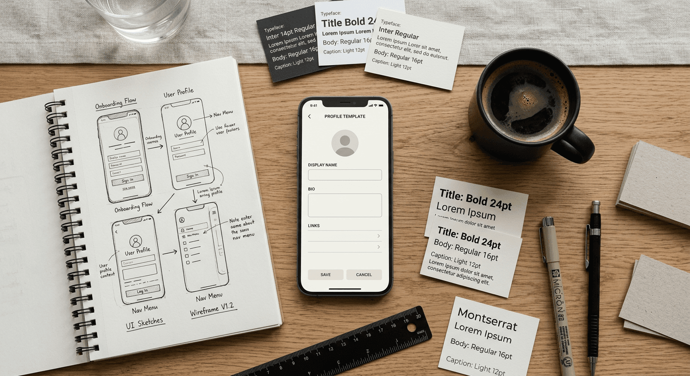
You are staring at the blinking cursor on the profile edit screen. You have exactly 150 characters, a 30-character name field, one external link, and roughly three seconds to convince a new visitor not to scroll away. Most users treat this small text block as an afterthought, pasting in a chaotic mix of emojis, vague job titles, and obscure quotes. Evaluating bio suggestions for instagram requires understanding that this space is not a personal diary entry. It is a highly constrained traffic routing mechanism designed to convert passing attention into a deliberate action.
Quick Summary
An effective profile bio is a 150-character conversion tool that balances immediate visual clarity with a specific call to action. Rather than listing everything you do, a successful profile structure prioritizes readability, directs the user toward a single external link, and clearly establishes your core value proposition.
- Search limitations: Only the Name and Username fields are indexed by the platform's search engine; the bio text itself is not.
- Negative space: Line breaks and spacing often communicate professionalism better than dense text blocks.
- Formatting risks: Custom fonts disrupt screen readers and platform algorithms.
- Action-oriented: The final line should always instruct the reader on what to do with the URL below it.
Table of Contents
- The Metrics of a Working Profile
- 1. The Minimalist Professional
- 2. The Typographic Curator
- 3. The Founder's Pitch
- 4. The Geo-Local Anchor
- 5. The Niche Keyword Stack
- 6. The Single-Action Funnel
- Profile Structure Comparison
- Matching the Structure to Your Goal
- FAQ
The Metrics of a Working Profile
Before choosing a profile format, you must define what the text is actually meant to achieve. Every format trades one advantage for another. A dense, keyword-heavy block of text clarifies exactly what industry you work in, but it is visually exhausting to read on a mobile screen. Conversely, a sparse, two-word bio looks highly confident and aesthetic, but it gives a new visitor absolutely no reason to click your URL.
When evaluating these structures, judge them against two criteria: readability and actionability. Readability measures how fast a scrolling user can parse what you do. Actionability measures whether the text creates enough friction or curiosity to force a click. You cannot maximize both in 150 characters, so you must choose a structure that matches your current business objective.
1. The Minimalist Professional
This structure relies entirely on negative space and stark brevity. It typically consists of two to three very short lines, utilizing stark nouns rather than descriptive adjectives. It is built for established creators, designers, and consultants whose visual content already speaks for itself, requiring the text only to frame the work rather than explain it.
The mechanism here is visual contrast. By leaving the majority of the 150-character limit unused, the text that remains draws immediate focus. A typical setup places a single title on the first line, a contact method on the second, and a URL pointing to a portfolio on the third. It explicitly avoids emojis, hashtags, and lengthy sentences. The design forces the visitor's eye straight down to the external link because there is nothing else to read.
High clarity, zero personality
The minimalist approach communicates high status precisely because it refuses to over-explain. It signals that you do not need to pitch the visitor.
However, it fails completely if your visual grid does not instantly clarify your value. If you are selling a complex service or operating a new brand without an established reputation, this format comes across as confusing rather than sophisticated. You cannot use minimalism if your audience needs to be educated on what you are actually selling. It also wastes the opportunity to handle basic objections or define a specific niche, meaning you will likely attract unqualified traffic to your link.
2. The Typographic Curator
This format utilizes external websites to convert standard text into specialized fonts - such as serif, cursive, or bold math sans-serif - before pasting it back into the profile. It is primarily used by visual artists, lifestyle influencers, and boutique online stores aiming for a specific brand aesthetic that the platform's default font cannot provide.
The mechanics rely on an aesthetic bio generator, which maps standard keyboard inputs to obscure Unicode characters. Because the platform renders Unicode exactly as pasted, the text appears as a custom font. Users typically deploy this technique sparingly, perhaps bolding a single headline or italicizing a core brand value, rather than converting the entire 150-character block.
Practical rule: Never use custom Unicode characters in the 30-character Name field. The platform's search index cannot parse mathematical or obscure Unicode sets, meaning your profile will instantly disappear from search results for your own name.
Visual disruption at the cost of accessibility
The advantage of Unicode formatting is immediate visual disruption; it breaks the visual monotony of the platform and signals a highly curated brand image.
The honest limit is severe technical degradation. Screen-reading software used by visually impaired audiences cannot read these custom characters, often reading aloud the literal mathematical code instead of the word. Furthermore, aggressive use of Unicode looks like spam to many users and makes the text physically harder to read on smaller mobile devices. If your audience skews older or relies on accessibility tools, this approach actively damages your brand.
3. The Founder's Pitch
The founder's pitch is a direct, problem-and-solution statement compressed into two lines. It is engineered for service providers, coaches, and startup founders who use their personal profiles strictly for lead generation.
This structure operates on a rigid formula: "I help [Target Audience] achieve [Specific Result] through [Mechanism]." It removes all personal trivia - hobbies, pet names, or vague quotes - in favor of a strict value proposition. The final line always contains an active verb directing the user to the link below. Routing that focused attention into a unified KODE.link - One Link for Everything prevents the friction of sending users to a generic homepage, ensuring they land on a page that directly answers the pitch they just read.
Perfect for conversion, terrible for casual networking
When executed correctly, this format acts as a ruthless filter. It repels people who are outside your target market and immediately qualifies those who stay. The clarity of the offer directly correlates with a higher click-through rate on your URL.
The drawback is that it strips the profile of its social context. It reads like a commercial rather than a human being. If your growth strategy relies on organic networking, peer-to-peer collaboration, or community building, the founder's pitch can make you appear unapproachable and overly transactional. People looking to connect with a peer will often bounce off a profile that immediately treats them as a prospect.
4. The Geo-Local Anchor
This structure firmly plants a business or freelancer in a specific physical location. It is essential for brick-and-mortar stores, local real estate agents, event photographers, and any business where proximity is the primary deciding factor for the customer.
The mechanism uses standard text conventions - often a pin emoji followed by a city name or neighborhood - placed prominently at the top of the bio. While looking for a good bio for instagram, local businesses often make the mistake of burying their location at the bottom. The anchor structure flips this, putting the city and state before the service description. It frequently leverages the platform's native location tag feature, but reinforces it in the text to ensure it is the very first thing a visitor reads.
Strong physical signals, limited digital scale
The anchor eliminates the most common friction point for a local service: a user wondering if they are in the service area. By stating the geography immediately, it builds localized trust and converts local profile visits into physical foot traffic or direct inquiries at a high rate.
However, establishing a strict geographic boundary actively limits digital scale. If a local bakery decides to start shipping nationwide, a bio heavily anchored to a single neighborhood will suppress out-of-state orders. Remote clients will routinely skip over service providers who heavily brand themselves as local, assuming they only take in-person meetings. You must abandon this format the moment your revenue model shifts to a national or global audience.
5. The Niche Keyword Stack
The keyword stack abandons sentences entirely in favor of a dense, categorized list of skills, credentials, or services. It is utilized heavily by freelance creatives, technical specialists, and multi-hyphenate professionals who need to immediately establish their breadth of capability.
The mechanics involve stripping out conjunctions and transition words, separating core terms with vertical pipes (|), bullet points, or slashes. Searching for instagram profile bio ideas often yields this format because it is highly efficient. A layout reading "Brand Strategist | UX Designer | Shopify Expert" consumes far fewer characters than attempting to weave those titles into a coherent sentence. It allows the user to cram maximum professional data into the 150-character limit, followed by an email address and a URL.
Immediate categorization, low narrative flow
The stack is unbeatable for rapid categorization. A hiring manager or potential client can scan the profile in a fraction of a second and know exactly what technical boxes you check. It functions essentially as a compressed resume.
The limit of this format is its complete lack of narrative or unique differentiation. A keyword stack tells the reader what you are, but it entirely fails to explain why you are better than the thousands of other profiles using the exact same keywords. It relies entirely on the visitor being motivated enough to click through to your portfolio to judge your actual competence. If you compete on unique methodology rather than raw technical skills, this format flattens your distinctiveness.
6. The Single-Action Funnel
The funnel structure subordinates the entire profile to a single, high-leverage action - usually a lead magnet, a digital download, or a product launch. It is designed for marketers, course creators, and authors running temporary campaigns.
The mechanism treats the 150 characters strictly as ad copy. It usually starts with a hook related to a specific problem, follows with a claim about a free solution, and ends with a heavy visual indicator - often a row of downward-pointing emojis (👇👇👇) - pointing directly at the URL. It sacrifices long-term brand building to maximize the immediate conversion rate of a specific campaign.
Immediate lead capture, high audience churn
This format generates the highest volume of immediate URL clicks because it offers a direct, risk-free exchange of value. It turns a static profile into a high-functioning landing page header.
The consequence is extremely high audience churn. Because the profile is built solely around extracting an email address or a download, visitors who consume the free value often leave without engaging with the underlying brand. Furthermore, it requires constant maintenance; a single-action funnel promoting a launch that ended three months ago signals a dead or abandoned profile. You should only use this structure if you are actively managing a live campaign and are prepared to rewrite it the moment the campaign concludes.
Profile Structure Comparison
| Structure | Primary Strength | Best Suited For | Failure Mode |
|---|---|---|---|
| Minimalist | Visual contrast and high status | Established designers, visual artists | Confusing for new or complex service brands. |
| Typographic | Brand disruption and mood | Boutique retail, lifestyle creators | Screen reader failure and technical degradation. |
| Founder's Pitch | Direct qualification of leads | Coaches, consultants, agencies | Alienates peers and casual networkers. |
| Geo-Local | High local trust and foot traffic | Brick-and-mortar, local services | Suppresses digital or national product sales. |
| Keyword Stack | Rapid skill categorization | Freelancers, technical specialists | Fails to differentiate from competitors. |
| Single-Action | High-volume URL clicks | Campaign marketers, course creators | High churn rate and requires constant updates. |
Matching the Structure to Your Goal
Your profile text should never be static. The structure you choose today should map directly to the specific bottleneck your business is currently facing.
If your bottleneck is unqualified leads clogging your inbox, deploy the Founder's Pitch to aggressively filter out bad fits before they click your link. If your bottleneck is a lack of local foot traffic, switch immediately to the Geo-Local Anchor and ensure your city is the first word a visitor reads. If you are launching a new digital product and need raw email captures above all else, strip out your professional credentials and use the Single-Action Funnel for the duration of the launch.
Do not attempt to blend these formats. A profile that tries to be a minimalist keyword stack with a single-action funnel attached will fail at all three. Pick the single metric that matters to your growth this quarter, build the 150 characters around it, and let the external URL handle the rest of the heavy lifting.
FAQ
Does changing my bio text affect my search rankings on the platform? No. The platform's search engine only indexes your Name field and your Username. The 150-character bio text is not searchable. You can rewrite it daily without impacting your visibility in the search bar.
Should I use hashtags in my profile text? Generally, no. While hashtags in the text are clickable, they act as an exit door. Clicking a hashtag takes the visitor away from your profile and drops them into a feed of your competitors' content. Only use a hashtag if it is a proprietary, branded tag that you exclusively control.
How often should I update the formatting? Update the text whenever your primary business objective changes. If you shift from building local awareness to launching a digital course, your text must change to reflect the new CTA. Leaving a stagnant promotional bio for months signals inactivity.
Why do some profiles have line breaks while mine groups together? Mobile formatting often strips out line breaks if there is a trailing space at the end of a sentence. To ensure a clean line break, remove any spaces after your final punctuation mark before hitting return. Alternatively, draft the text in a separate notes app and paste it into the platform.
Is it safe to use custom typography across the entire text? It is highly discouraged. While a few custom characters might fit a specific aesthetic, formatting the entire block in Unicode renders it completely unreadable to visually impaired users relying on screen readers, and often breaks formatting on older mobile devices.